cocktail recipes and learning prototype

A cocktail mobile app designed for both novices and connoisseurs to learn and experiment with liquor and recipes.
*For the sake of experimentation and learning, I used Death & Co.'s recipe book as the anchor for my project. Not only are they one of the best bars in the world, but their book beautifully blends their deep intention in making cocktails with helpful lessons from liquor to bar tools.
Team
Independent Project
Project Timeline
2 weeks
research + competitive analysis
Before diving into design, I looked at potential design conventions in both food recipes and drinks mobile apps. Below are some of my findings:
- Names: For food recipes, users can easily make an informed guess when choosing to view a recipe or not.
Insight: This makes full-screen scrolling possible. - Categorisation: Many current drinks apps have a simplified and/or party-themed categorisation system.
Hypothesis: This could potentially alienate users who are more serious in making cocktails / mixology. - Flavour profile is more important than what bottle of liquor to buy. Abstracting from the prior 2 insights, I realised that for drinks recipes, it is more important to show what the flavours are over what type of liquor or even which bottle to buy.
ideation
ui
I went through many iterations on the UI in order to create a look & feel that is confident and sophisticated while showcasing enough information for a user to navigate through a stream of recipes.
information architecture
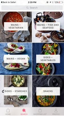
Death&Co. had a detailed 24-level categorisation that differentiated, for example, "Gin Shaken" from "Gin Stirred".
With the hypothesis that many novices would not care of the difference, I narrowed the 24-levels to 13 for the app. This information architecture was later confirmed to be positive during usability testing.
user flow
In order to suit the needs of novice and expert users, the user flow is divided into 3 parts.
- Recipes Home: Placed as the home screen, the user can explore different recipes by either choosing to customize his/her drink or to choose from one of the single liquor categories.
- My Bar: To suit scenarios where the user may want to remember a recipe or is at a party and wanted to share it with a friend, he or she can quickly view their saved recipes and liquor list.
- Learning: The learning section is currently divided into 3 parts - liquor, modifiers, and bar tools - and allows users to learn about each on the fly.
high-fi mockups
1. recipes home
Added "Customize your drink" to encourage users to discover new and/or tailored recipes.
2. FIRST RECIPES GLANCE
Showcases the cocktail's flavour profile before viewing the entire recipe.
3. recipe card
Easy-to-flip card format.
4. customize your drink ui
Liquor and Flavor choices.
5. my bar
Saved recipes and personal liquor list.
6. learning
Ability to learn about the history and make of a variety of liquor, modifiers, bar tools etc.
demo
stay tuned!
I'm working on putting the revised prototype into a consumable format for the web, be ready soon! :)