branding + web design

Empowering a new national initiative to improve youth social and mental wellbeing with a resonating brand and landing page.
Client
JW. McConnell Family Foundation
Team
Studio Jay Wall
(contract branding partner)
Project Timeline
4 weeks
(web design + implementation)
My Role
Web Design + Implementation
Marketing Strategy
*I also was their social innovation lab advisor
initial exploration - ideation session
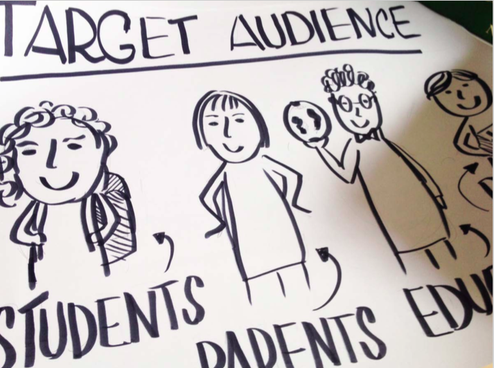
Empathy exercise for our target audience

Team ideation
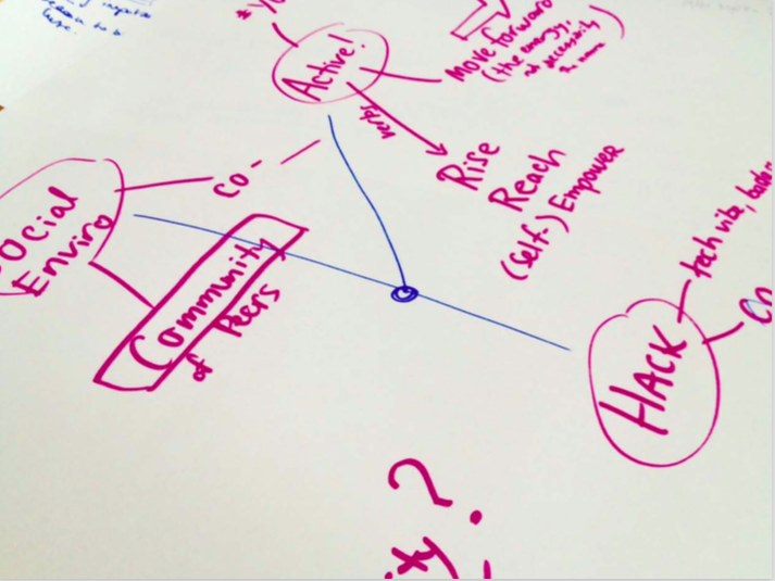
Mind mapping
branding creation

Initial logo concepts

Matching logos to potential palettes and typefaces

Creating document layouts
visual elements

We intentionally designed our logo so that it can be easily taken apart to create compelling visual elements for many different formats and purposes.
introductory video
website design + implementation
Overall information architecture and wireframing
final website
mobile view
Mobile fully takes advantage of this layout with easy to flip through content and sections.
large banners + centralised copy
Large banners and a scroll-down interaction works well with the current site due to the short copy under each section. This relieves the user from having to click many buttons just to consume short pieces of information (and wait for load times).
The choice of centralising the body copy is also to balance out the shortness of each section. However, see below to how I would change this design below.
what I would do differently now
1. Website Layout: Due to the shortness of the content, I decided to centralise all body text. This was a lazy and not very elegant solution. If I had more time, I would play around with more sophisticated grids and had a 3-level typographic hierarchy to separate out content better.
2. Information design: Since many of the concepts of WellAhead is new to most of our audience + target users, I could have also added a few more infographics or icons to illustrate our value better.